Performance
The performance page allows you to have a better view of the production rate of your machines when they are running. Note that in this article, for the sake of generalization, we will refer to units to designate the products manufactured by your plant. In reality, it will be parts, sheets or whatever else you produce.
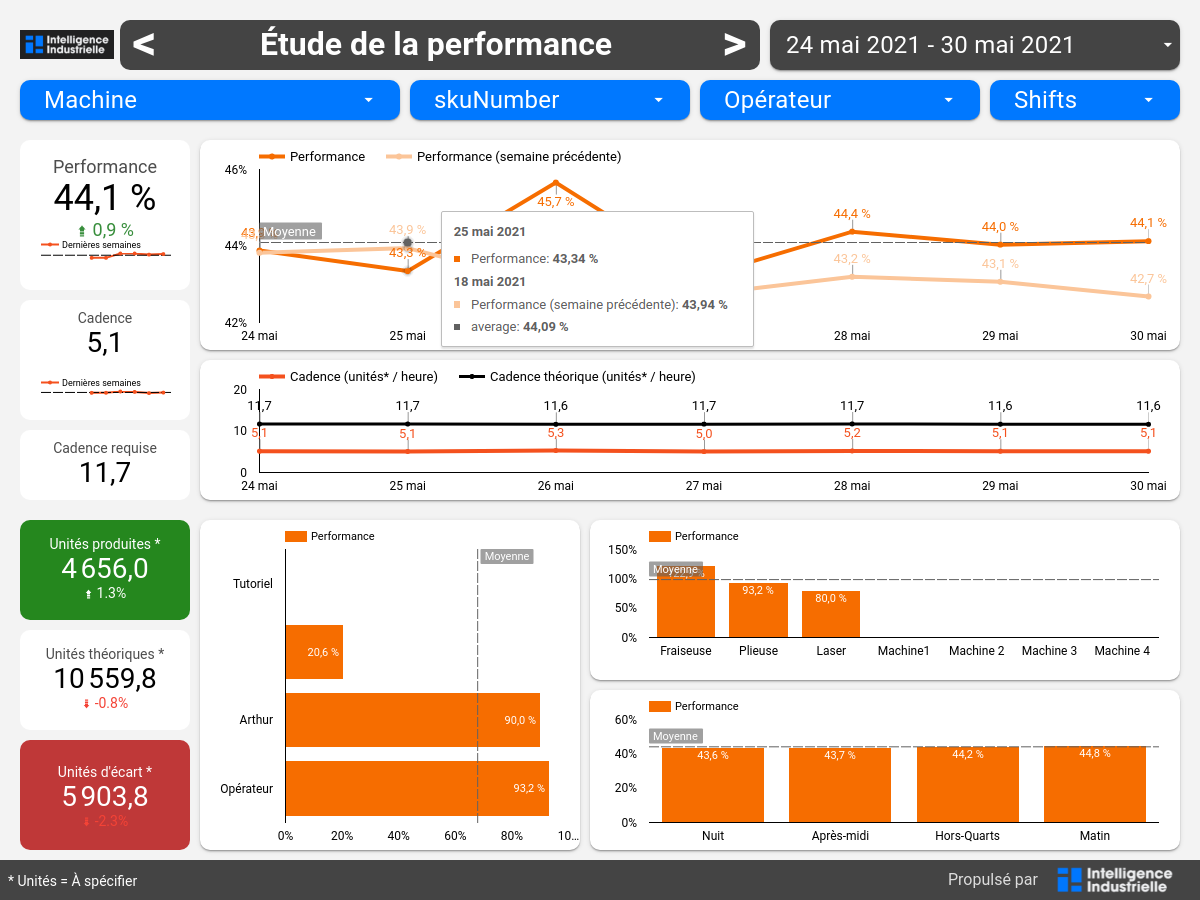
In the upper left corner of the performance report, the performance rate and the average rate are displayed, as well as their evolution over time.
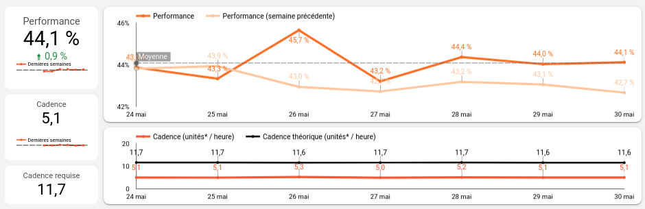
Below the performance figure, the progress index shows its evolution compared to the previous time period. Just below it, a graph shows the evolution in the indicator compared to the previous 12 weeks. The black horizontal line represents the average over these 12 weeks.
The required production rate is calculated from the optimal completion time of a unit. It represents the maximum number of units that can be produced for one hour of operation.
The first graph shows the evolution of the performance rate from day to day for the current time period and, in lighter color, for the previous time period.
The second graph shows the evolution of the performance rate from day to day, compared to the required performance rate.
At the bottom of the page there are some additional indicators and graphs.
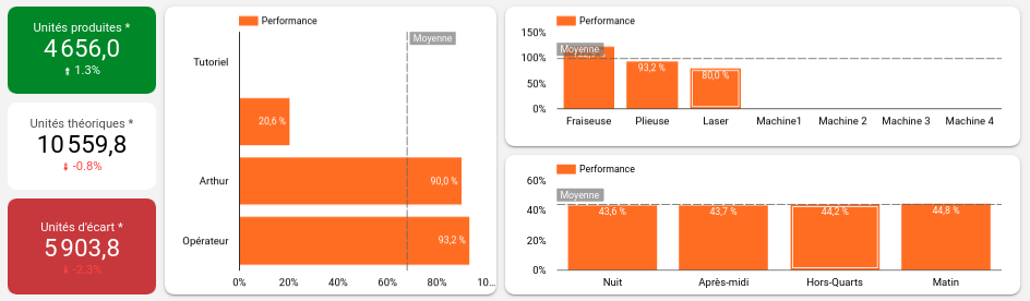
On the left side, the green tile shows the number of units that have been produced over the period of time and the white tile shows the number of units that should have been produced in that same period of time with the required production rate. In the red tile, it is simply the difference between the two, which represents the number of units that should have been produced but were not.
The first graph (center left) shows the performance for each of your operators. It allows you to see at a glance which operators are overperforming and which are underperforming.
The second graph (top right), segments the performance by machine for the machines you selected in the machine filter at the top of the page.
Finally, the third graph (bottom right), segments the performance by shift for the shifts you selected in the shift filter at the top of the page.