Availability
The availability page allows you to have a better view on the uptime of your machines. In particular, it shows the time in production, the planned downtime and the unplanned downtime.
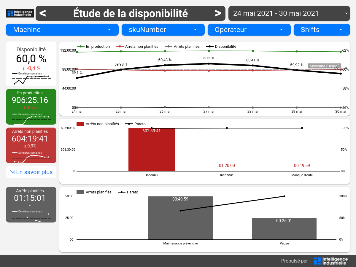
On the left-hand side of the page, these indicators are displayed in tiles for the time period selected in the filters.
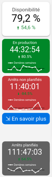
For each of these tiles, the progress index shows how the indicator changed compared to the previous time period. Below, a graph shows the change in the indicator compared to the previous 12 weeks. The black horizontal line represents the average over these 12 weeks. Below the unplanned stops tile, the "En savoir plus" link takes you to the detailed stop study page for a more in-depth view of unplanned stops.
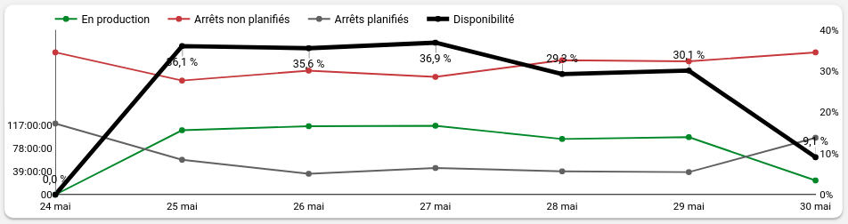
In the center of the page, the first graph shows the evolution of availability (in percentage) and production time, planned downtime and unplanned downtime (in hours) from day to day.
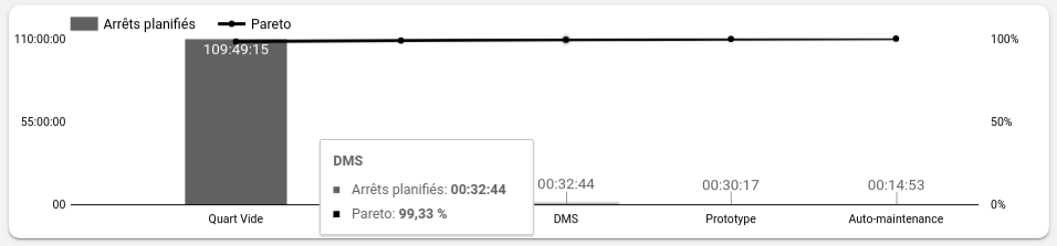
The second graph shows the time of the most frequent unplanned stops ordered in descending order of total duration.
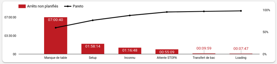
At a glance, it is quite easy to see which causes of downtime are the main ones responsible for the non-operation of your machines. The black "Pareto" line represents an ogive of unplanned downtime. For example, in the image above, a plant manager who managed to reduce the "Manque de table" and "Setup" downtime to 0 would have reduced the unplanned downtime by 77% for that period of time.
Finally, the third graph plays the same role as the previous graph, but for planned downtime.