Tile Types
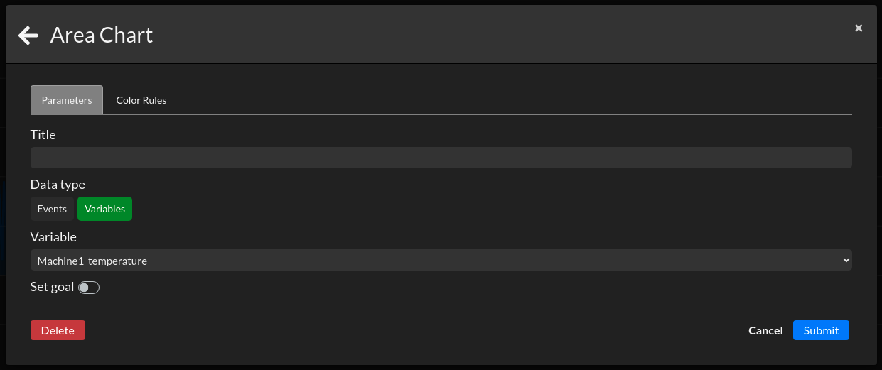
Area Chart
The Area Chart tile represents a single data source on a given period.
You can choose 2 types of data: Events and Variables.
Your specified event will increment over time on the chart. You can set a goal to see if your shifts requirements are met.
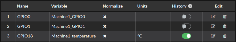
To use variables, you need to activate the history for the data you want to visualize (toggle on the far right of the properties/variables table).
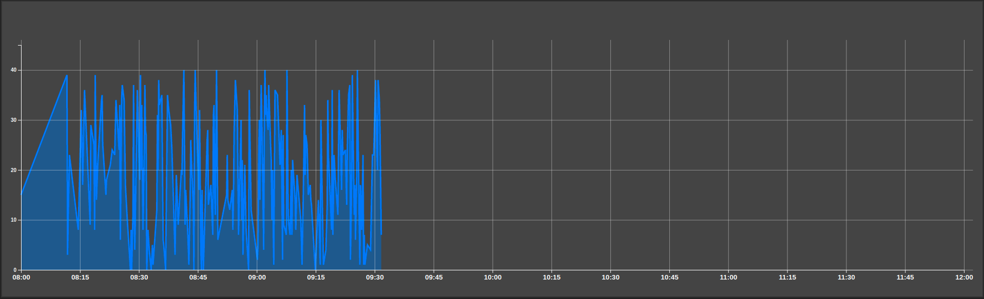
This example is with a temperature, recorded over time.
Audio
The Audio tile can use text to speech or an audio file stored in the cloud.
To trigger the sound, the tile listens to a variable, just as a Value trigger will trigger the audio according to your configured value change settings.
For text to speech, it is to be noted that the language used will match your selected language (French or English).
Per the autoplay policy, the sound is blocked if no user interaction has been made with the application.
There is a command line to open Chrome with the autoplay policy changed:
chrome.exe --autoplay-policy=no-user-gesture-required
This command line works on Windows and Linux.
Here are more informations about the autoplay policy for Chrome.
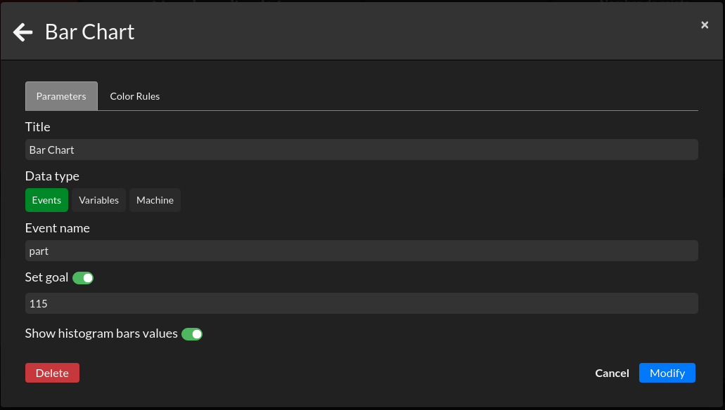
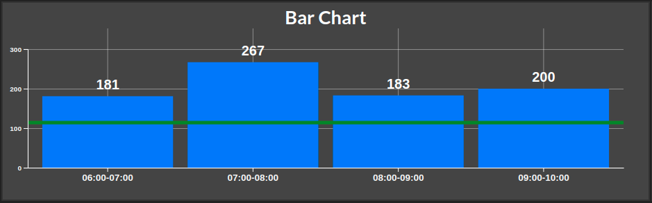
Bar Chart
The Bar Chart tile represents the sum on each hour of a data source on a given period.
You can choose between 3 types of data: Events, Variables and Machine.
For the events, the result shown is the count for each hour of your specified event.
To use variables, you need to activate the history for the data you want to visualize (toggle on the far right of the properties/variables table). Bar Chart has a specificity with variables; since you can not show the evolution over time with a single data point for each hour (a temperature per example), you have to choose either to display the sum, minimum or maximum for this variable.
Machine allows you to see the part event of a specified machine. Available options are: input part, output part, good part and defect.
This example is a simple event count. The option to display the values on the chart is toggled on.
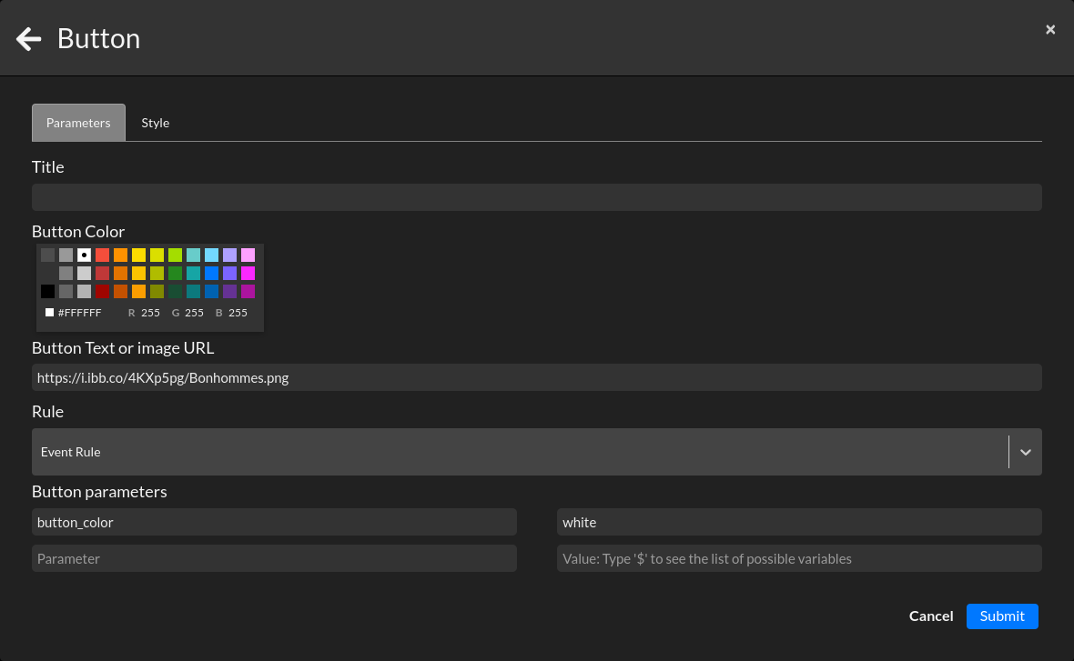
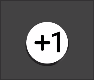
Button
The Button tile allows you to have a virtual button on your dashboard. Useful for your operator for any kind of manual input since you link a rule to your button.
You can choose a color for the background and put some text or an image link in the middle of your button.
Parameters are an advanced configuration feature. Per example, if your rule triggers an event, your parameter/value will be recorded as an added info to your event and could be seen in the events page as an extra "Field".
The exemple will trigger a rule with an Event action, we will customize our button with an image and add a parameter to our event.
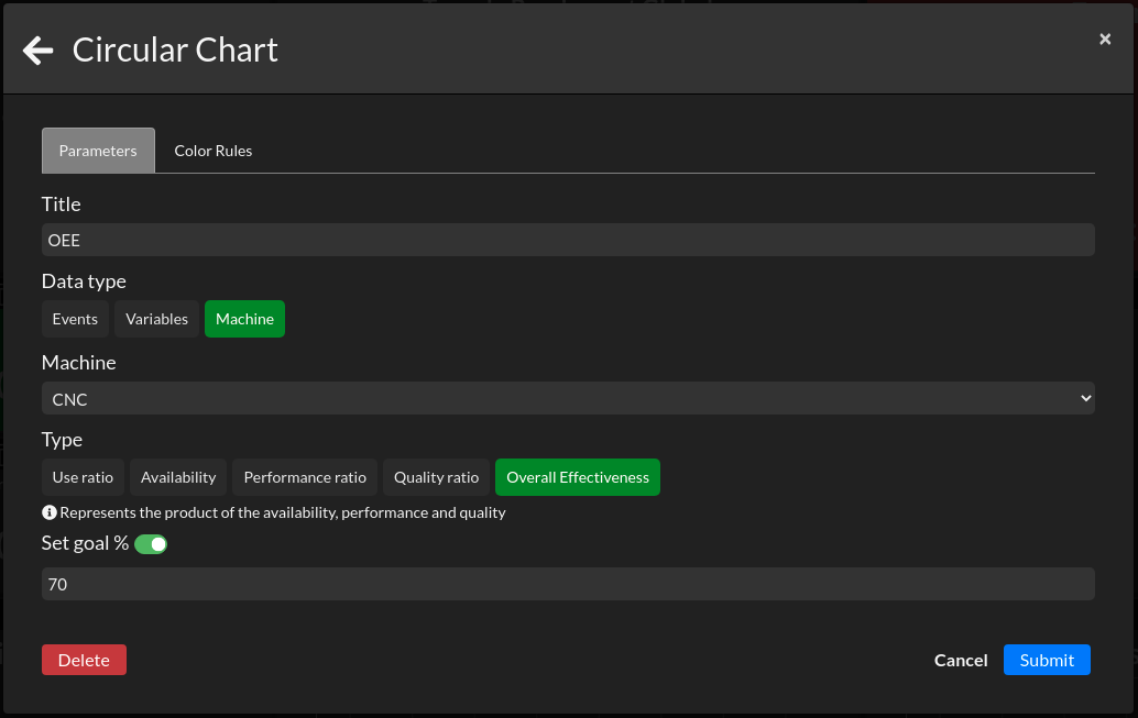
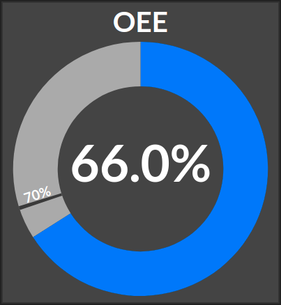
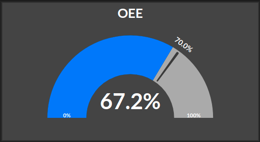
Circular Chart
The Circular Chart tile, or donut tile is usefull to represent a percentage with a goal line. In most cases, we use it to represent OEE data like the OEE itself or the availability, perfomance or quality. The selected time period is your shift by default and the goal line is optional.
You can choose between 3 types of data: Events, Variables and Machine.
For the events, the circular chart represents the count of your specified event. You will have to give an interval from 0 to a max event count.
To use variables, you need to activate the history for the data you want to visualize (toggle on the far right of the properties/variables table). Like the events, you will have to determine an interval between 0 and MAX.
For the machine, you have to specify the machine to observe and then select an OEE KPI among: Use ratio - Availability - Performance ratio - Quality ratio - Overall Effectiveness. The definition of these KPIs is described juste below your selection in the form.
Data Entry
The Data Entry tile allows you to manualy change the value of a variable or stream property from a dashboard.
Choose the variable you want to reassign. If the current value of this variable is a Boolean, then your tile will show a 1 (true) and a 0 (false) as inputs.
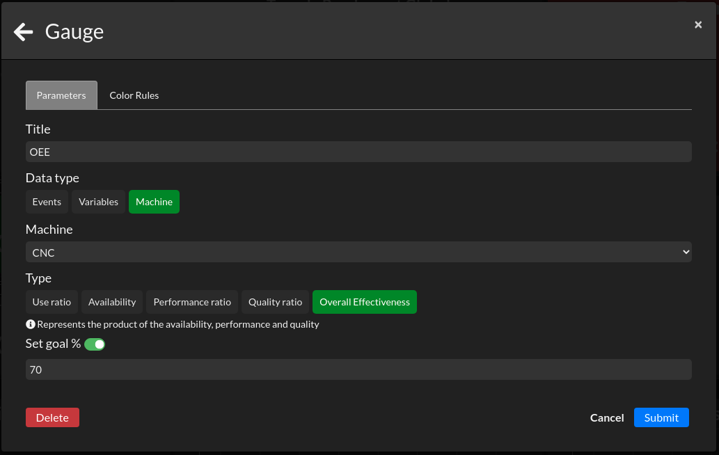
Gauge
The Gauge tile is design to visualise a goal or to monitor an input that should stay inbounds of a certain interval. The goal line is optional.
You can choose between 3 types of data: Events, Variables and Machine
For the events, the gauge represents the count of your specified event. You will have to give it an interval to bound the min and max of your chart. We highly recommend for events to start from 0 and set your max slightly above your goal line to see how much you completed your goal.
To use variables, you need to activate the history for the data you want to visualize (toggle on the far right of the properties/variables table). Like the events, you will have to determine an interval to bound your graph.
For the machine, you have to choose the machine to observe and then select an OEE KPI among: Use ratio - Availability - Performance ratio - Quality ratio - Overall Effectiveness. The definition of these KPIs is described juste below your selection in the form.
Info
The Info tile is useful if you want to put an instruction sheet at the disposal of your operator and do not wish for it to take the whole screen. Click on it and the configured picture or website will appear in a popup.
See the section on the Media tile to see what can be displayed.
Machine State
The Machine State tile represents the current state of your machine: green for ON, red for OFF.
See the full article on how to build your Machine State here.
If your Machine State is already configured, directly go here to see how to configure the tile.
Media
The Media tile allows you to show any kind of content from the web. If you want to show a dynamic website, you can also add a refresh rate and the tile will refresh the link with a rate from 1 minute to 90 minutes.
It is possible to display :
- a picture
- a video
- a website
- a file from a personal OneDrive with the Embed option when you right-click on the file
- a PowerPoint, Word or Excel from SharePoint by adding &action=embedview at the end of the link
- a PDF, Slides, Document or Sheets from GoogleDrive by changing view for preview or adding preview at the end of the link
- an IP camera
This video in French, shows you how to display a PDF on your dashboard from your personal OneDrive or GoogleDrive.
The example below shows how to display a picture and a website.

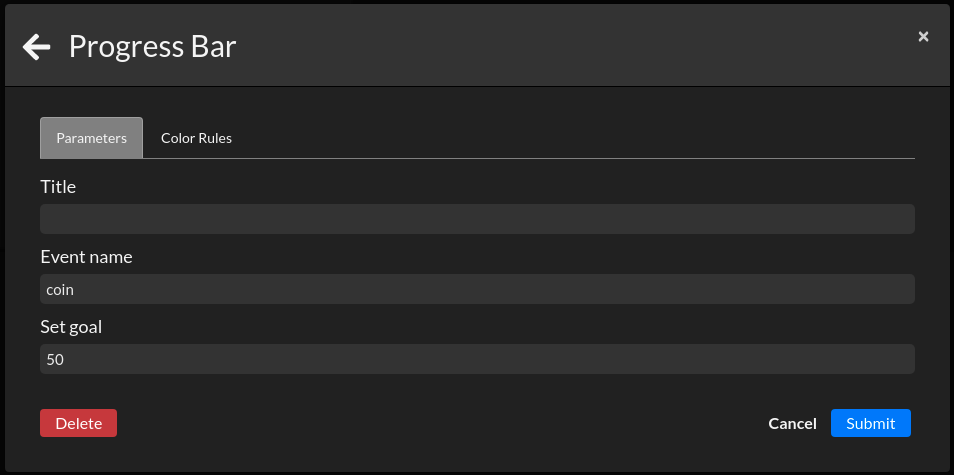
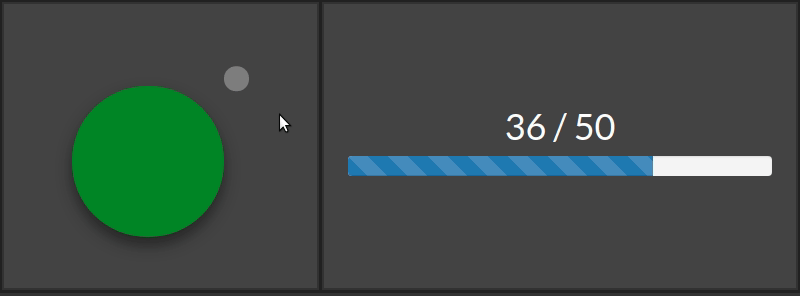
Progress Bar
The Progress Bar tile is configured with events. The bar "loads" with your event count from 0 to the goal you configured.
The exemple below shows how to configure the tile and how the tile shows progress.
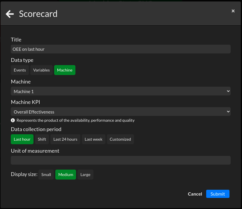
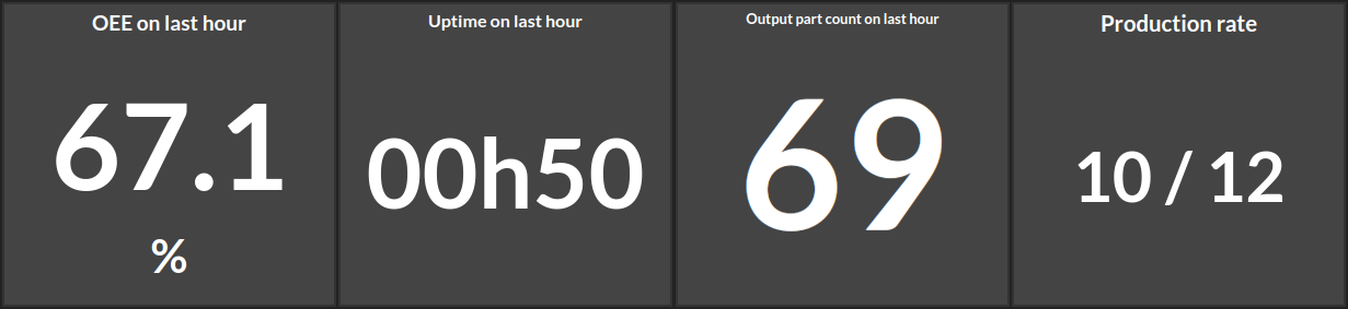
Scorecard
The Scorecard tile is one of the most important and powerful tile in the application. It can show you a live variable or event count and also compare them to the previous shift if the data is recorded. With that, the scorecard can also display over 25 machine KPI such as your OEE, planned production time, production rate, etc.
The first picture is the form configure to show the OEE of "Machine 1" on the last hour. The results below will show some examples of the different KPIs you can have in your scorecard.
Comparison metric
With the scorecard, you can compare the displayed value to the value from a previous period of time. Like in the images below, the comparison metric will give you a colored indicator. The selected data type can be either events or variables. Variables must have an activated history.
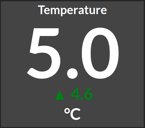
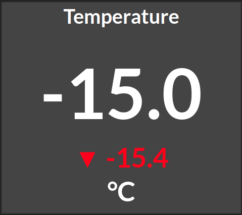
The comparison metric can be shown either in absolute value or in percentage.
It's important to note that if you select "Shift" as the data collection period for the comparison metric, the compared shift will be the previous one. This means that if you have a day shift it will compare to the night shift. It is not possible to compare the current day shift with yesterday's day shift.
Stopwatch
The Stopwatch tile is useful if you have a setup time you want to visualise, or if you have a Tack-Time in your factory and you need it displayed on a TV.
Here is a video, in French, on how to create, display and interact with stopwatches from a dashboard and with the rules engine.
Text
The Text tile is a simple text box. The text adapts to the size of your tile, but you can also mannualy reduce or enlarge the text's size.
We, at Intelligence Industrielle, often use it to write the name of the machine the dashboard corresponds to. It's easier to recognize one from an other.
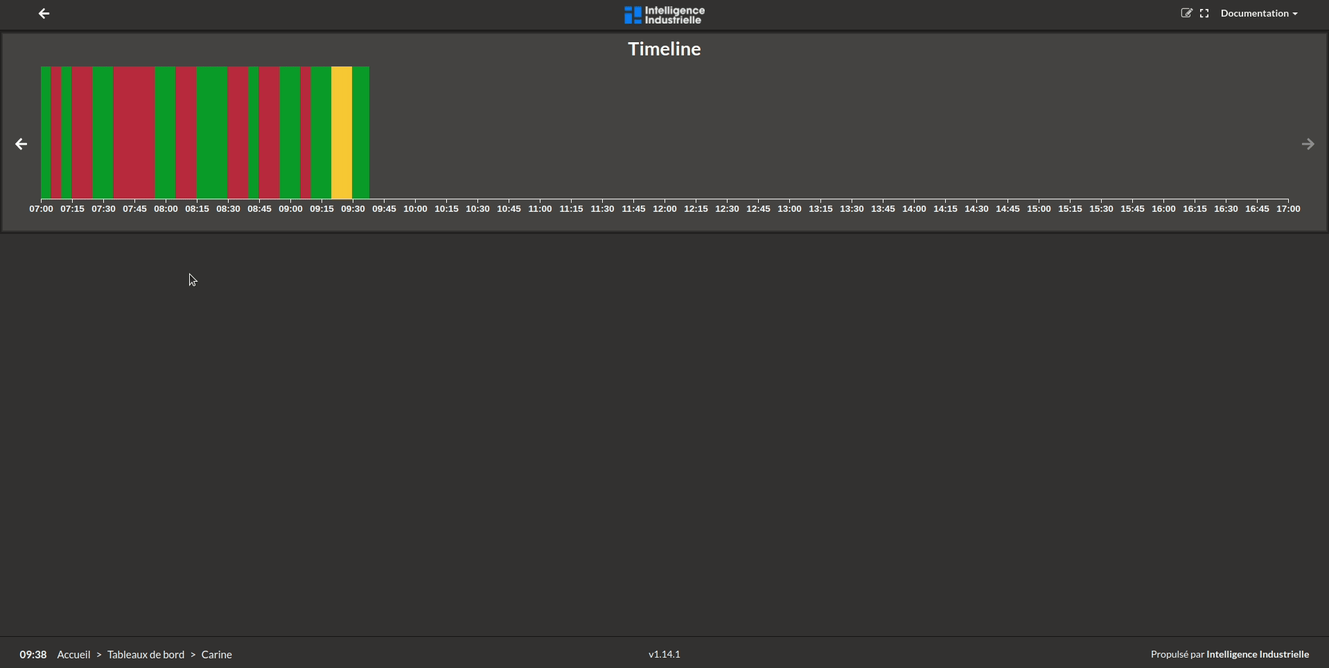
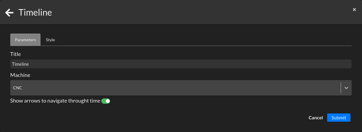
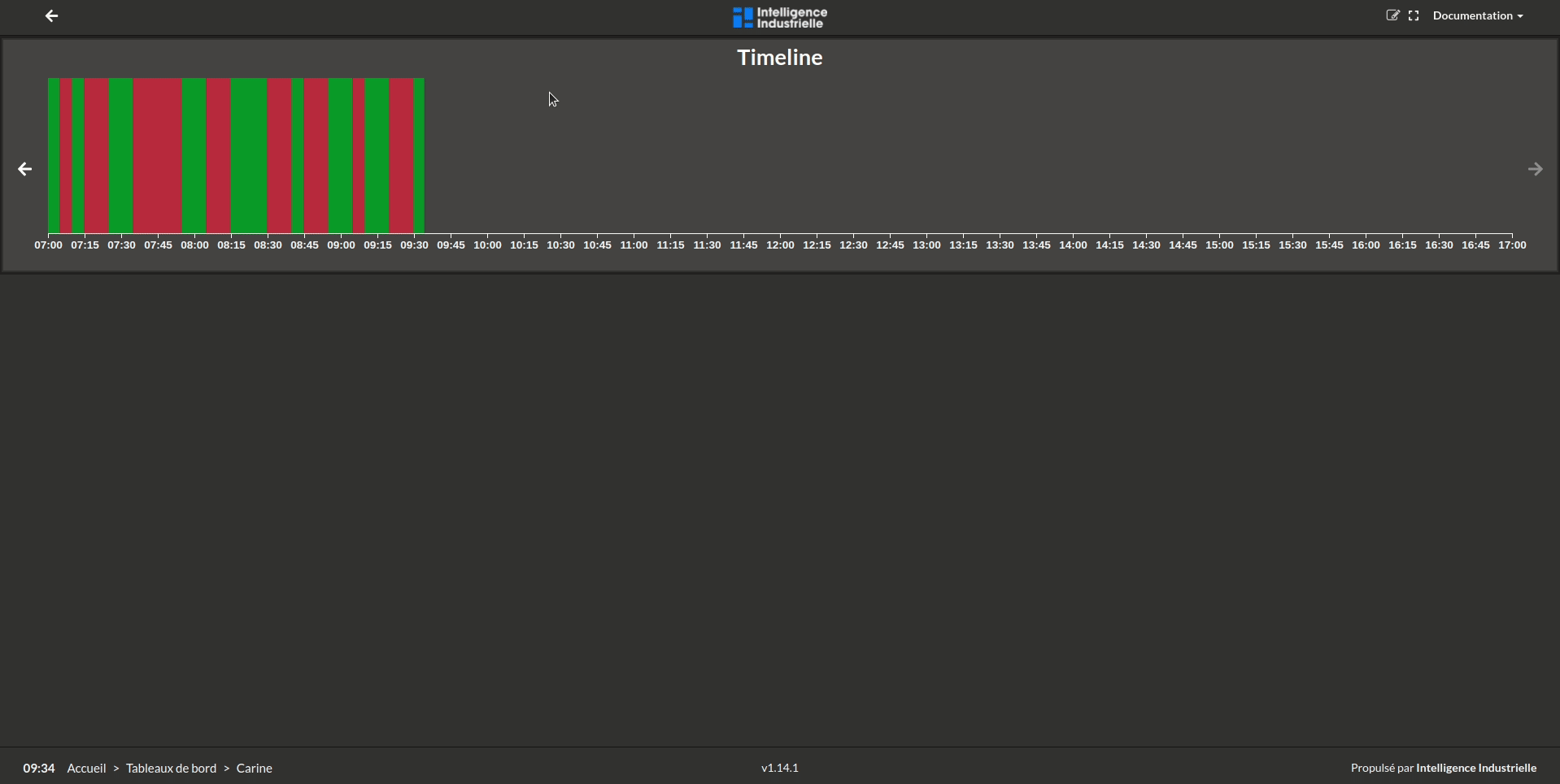
Timeline
The Timeline tile is a core tile in the application. It visualizes the state of one machine over time: green when it's ON, red when it's OFF. The tile is also used to interact with the machine stoppages visible on your timeline. It is possible to detail a stop with a cause and to navigate in time with the arrows. See the full article on how to build your Machine State here.
Below, here is the example of what happens when you click on a stop to detail the cause.
Below, here is the example of what happens when you click on the arrows to navigate through time.